


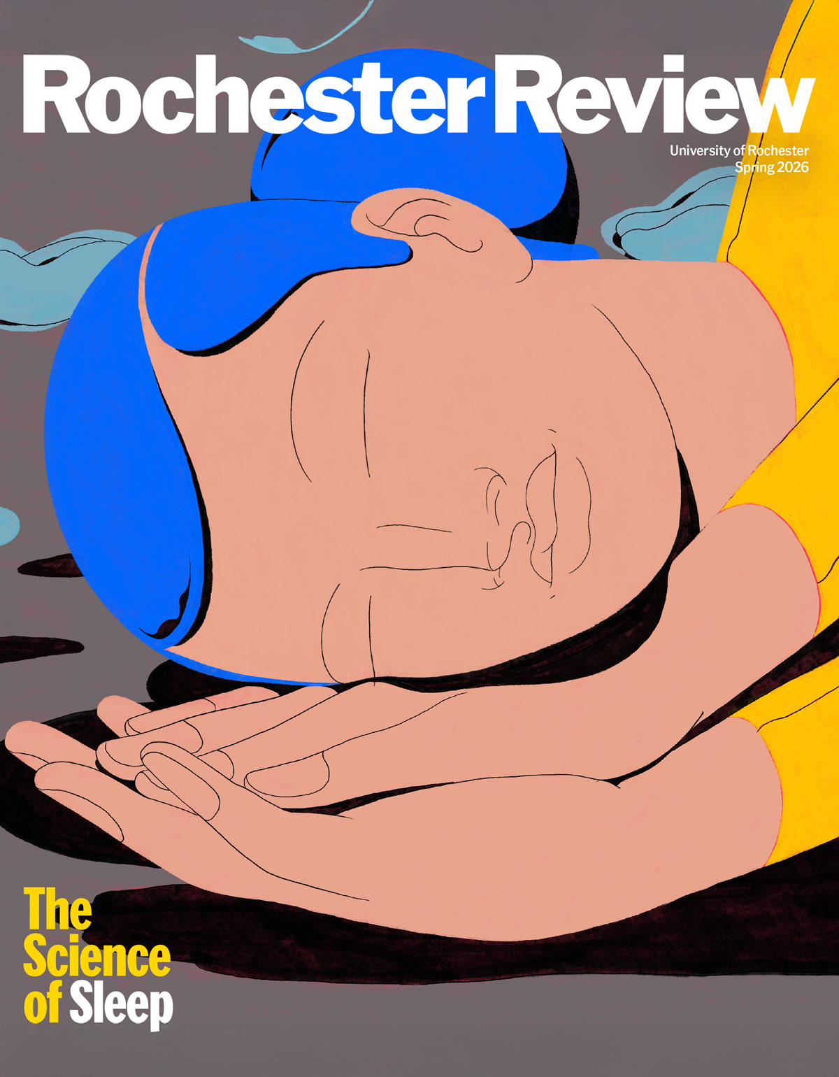
Spring 2026
University Magazine
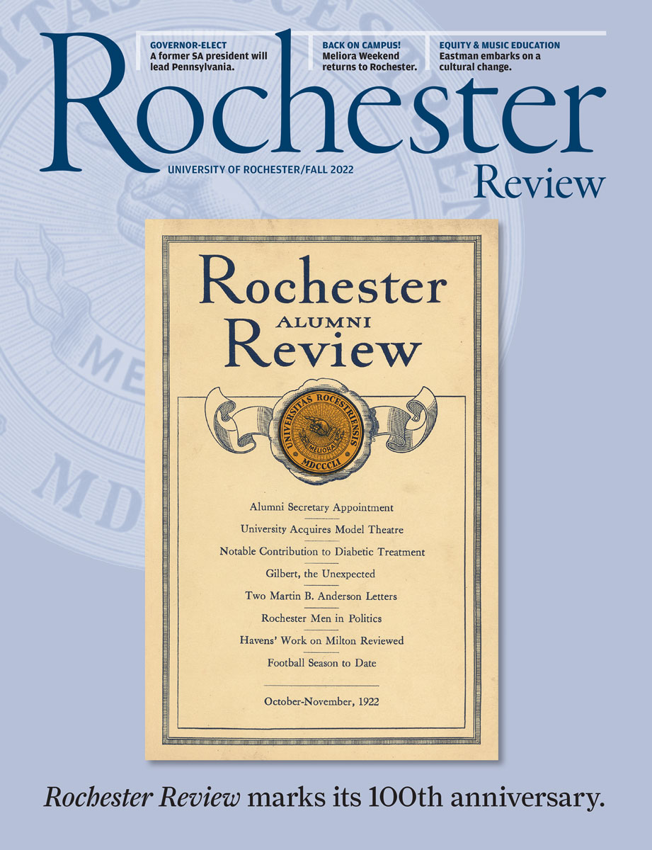
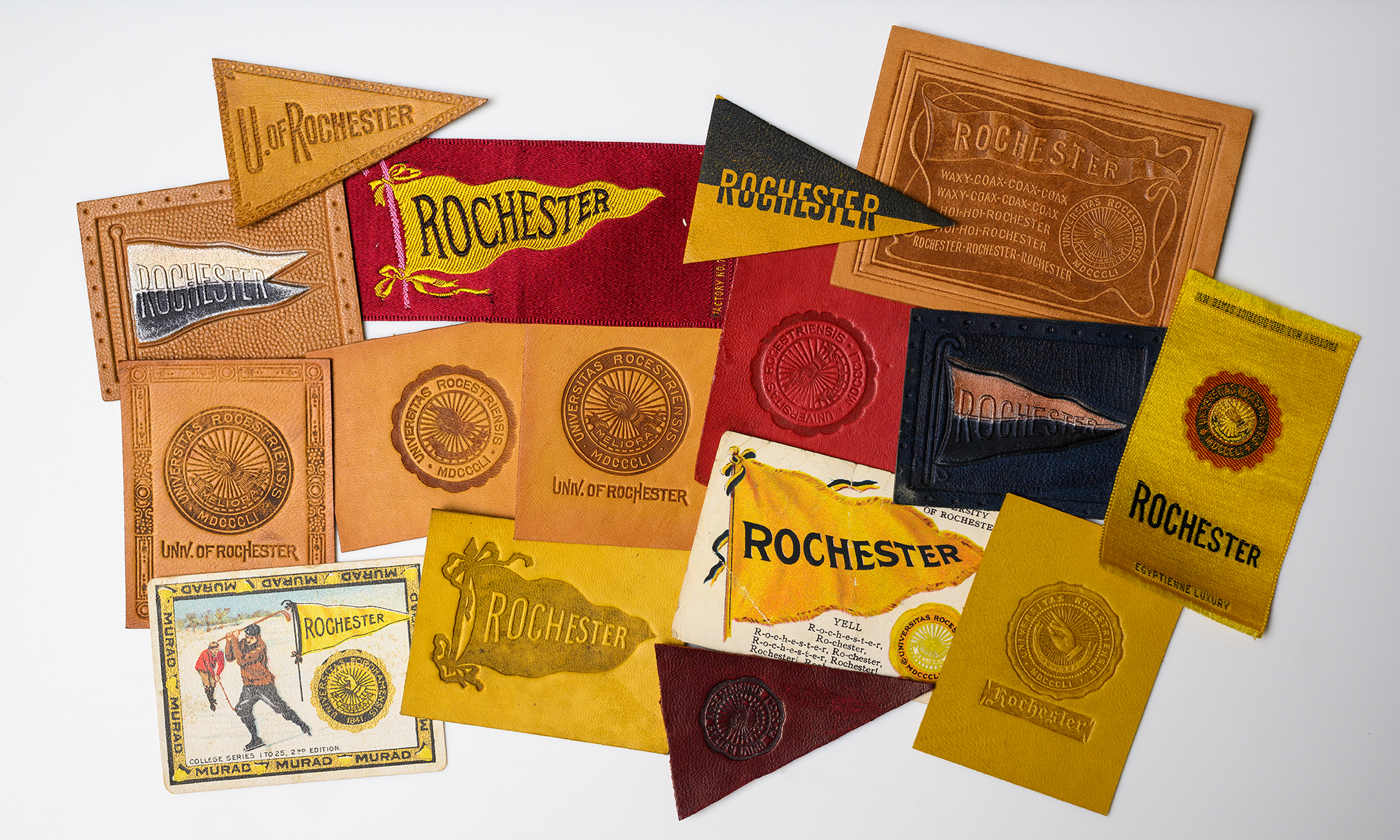
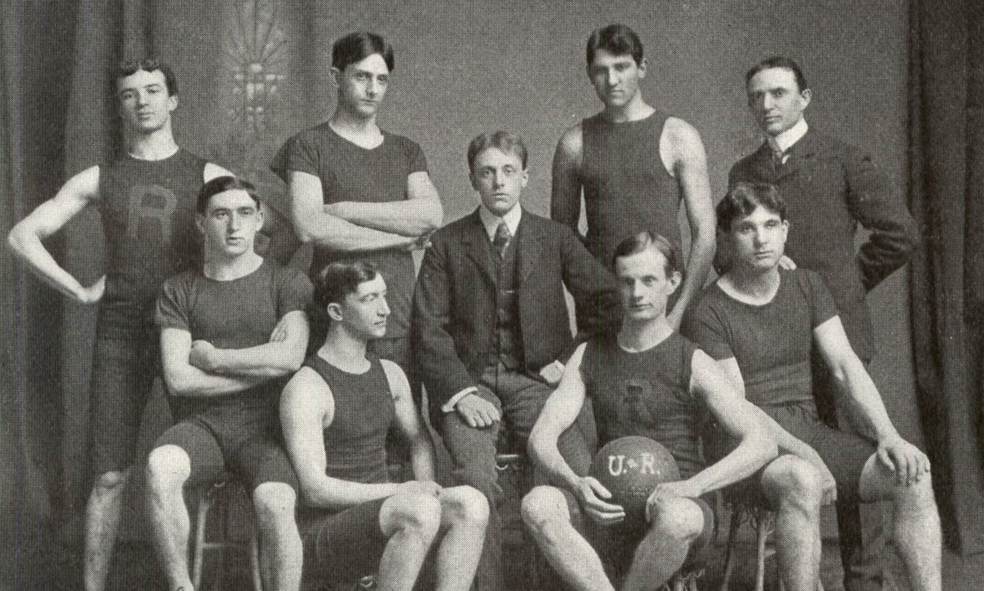
Since 1922, Rochester Review has chronicled inspiring stories that capture the University’s enduring commitment to academic, research, performance, community, and professional excellence.
Journey back to 1922 with Rochester Review! Discover every issue from our storied past through the University Library’s Digital Collections—a rich repository of academic, cultural, and community milestones.
Have questions, comments, or story ideas? Reach out to the Rochester Review editors and let us know what you’d like to see next.