Rochester Core component documentation
Explore the other components available on the Rochester Core WordPress theme.
Rochester Core
Explore documentation around Rochester Core’s Testimonial component.
After selecting the Testimonial component on any page that uses the Rochester Core plugin, you’ll be presented with the following options to customize the display and enter content.
Scroll down to the “varied width content” area and click “add module.” This will open up a list of all the components. Select testimonial and it will be added to the varied width content area.
The field is where to add the title or headline of the testimonial. The title can be styled but the text will be bolded by default.
The content block is where a description can be added below the title. Usually this would include a sentence or two describing what the testimonial content is about.
The testimonial component supports five background colors. These can be selected by choosing the desired color.
The style option refers to two different display options for the testimonials.
The main field of the testimonial component is the pull quote field. This is where to add the quote to the component. There is no need to add quotation marks here — they’ll be automatically added.
To add attribution for the above quote, use the attribution field. This will automatically add and format the persons name below the quote.
The wrapping link is an optional field that allows the testimonials to become clickable links. Click the “select link” button and add a link to the “url” field. This will then turn the testimonial into a clickable card.
An image can be added to the pull quote for greater visual impact. Using a picture of the person saying the quote is a great idea! The recommended dimensions for the image are 1,230px by 820px.
This option determines which side of the screen the image selected above will show on. This setting is only applicable if only one testimonial is being added. If more than one is being added, all of the images will be displayed above the pull quote. On a mobile device, the media will stack above the text content if left is selected, below if right is selected.
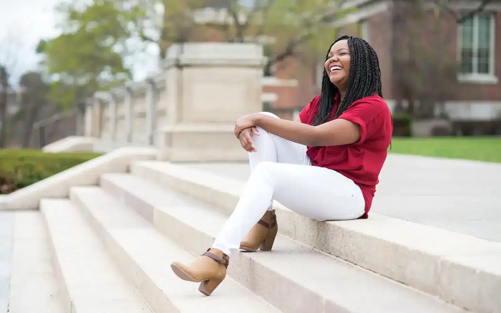
Students at Rochester forge their own path. Whether it’s through research opportunities, our flexible curriculum, or rich campus culture, there’s plenty of ways to take your education to the next level.
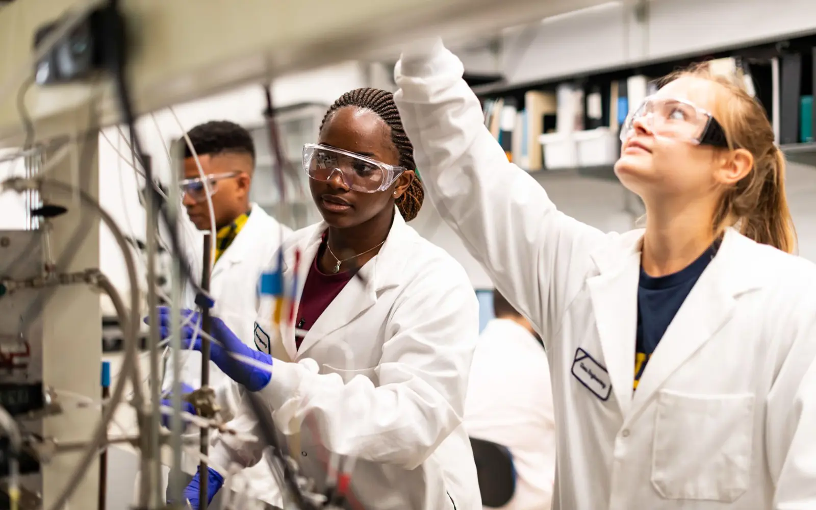
When I saw that Rochester allowed students to follow their passions due to their open curriculum and cluster system, I knew it was a perfect fit for me because I could major in engineering while having a cluster in music.

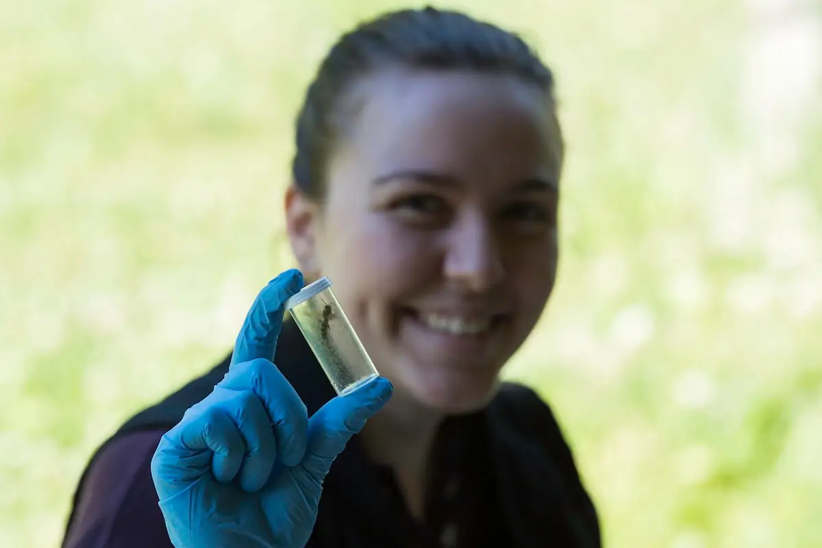
Conducting independent research… has been one of the best decisions I made at Rochester… It’s made me surer of what I want to do in the future and what career I want to pursue. I definitely feel more confident as a scientist and student.
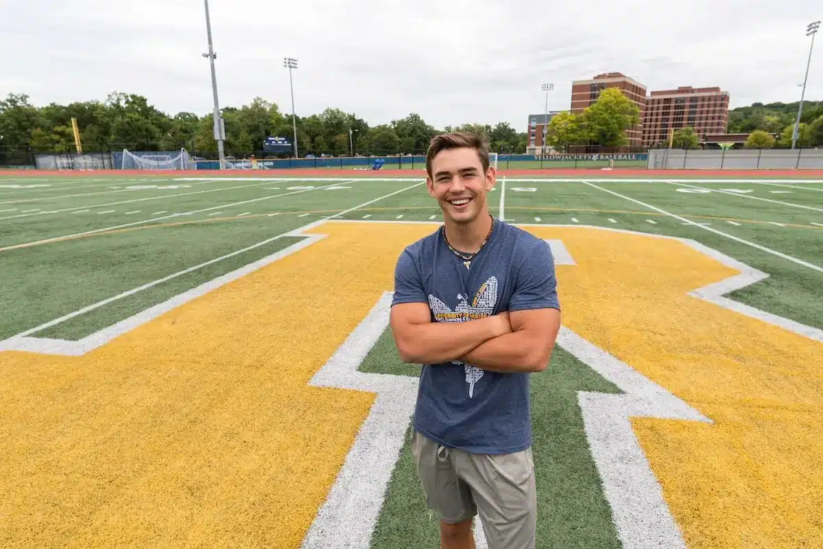
I came up for a visit and fell in love with the campus, the open curriculum, and the people here.
Lorem ipsum dolor sit amet, consectetur adipiscing elit, sed do eiusmod tempor incididunt ut labore et dolore magna aliqua. Ut enim ad minim veniam, quis nostrud exercitation ullamco laboris nisi ut aliquip ex ea commodo consequat
Lorem ipsum dolor sit amet, consectetur adipiscing elit, sed do eiusmod tempor incididunt ut labore et dolore magna aliqua. Ut enim ad minim veniam, quis nostrud exercitation ullamco laboris nisi ut aliquip ex ea commodo consequat