Rochester Core
Tab component
Explore documentation around Rochester Core’s Tab component.
1. How-to video: Tab component
2. Tab options
After selecting the tab component on any page that uses the Rochester Core, you’ll be presented with the following options to customize the display and enter content.
The title field is where to add the title or the heading for the entire tab component. Keep in mind titles for specific tabs will be added later. Styling the header as an H2 is recommend.
The background color selector is where to choose the background color of the entire tab component. This color will serve as the backdrop for your tabs.
There are two ways to display the tabs:
- Horizontal: Choose ‘Horizontal’ for a left-to-right arrangement, supporting three tabs or more.
- Vertical: Choose ‘Vertical’ for a top-to-bottom stack, supporting 3-6 tabs.
Enter a brief overline text that appears above the tab title. Use this for labels or categorization.
Enter your tab title here. For best results, we recommend using H2 or H3 styling for clear emphasis.
Add supporting text for the tab. For clarity, use paragraph styling for detailed information or bullet lists for concise points. Keep text concise (400 characters max) to ensure readability and scannability. Focus on high-level insights and key takeaways.
Choose an image to visually represent this tab. Recommended image dimensions: Vertical orientation: 840px by 840px (1:1), with a centered focal point for optimal display. Horizontal orientation: 1216px by 840px (3:2), with a centered focal point for optimal display.
Choose where the image will be positioned on the tab to best fit your content layout. (Left or Right)
3. Example tab component
Explore demos of the tab component below. You can create horizontal or vertical versions with gray, navy, or charcoal backgrounds.
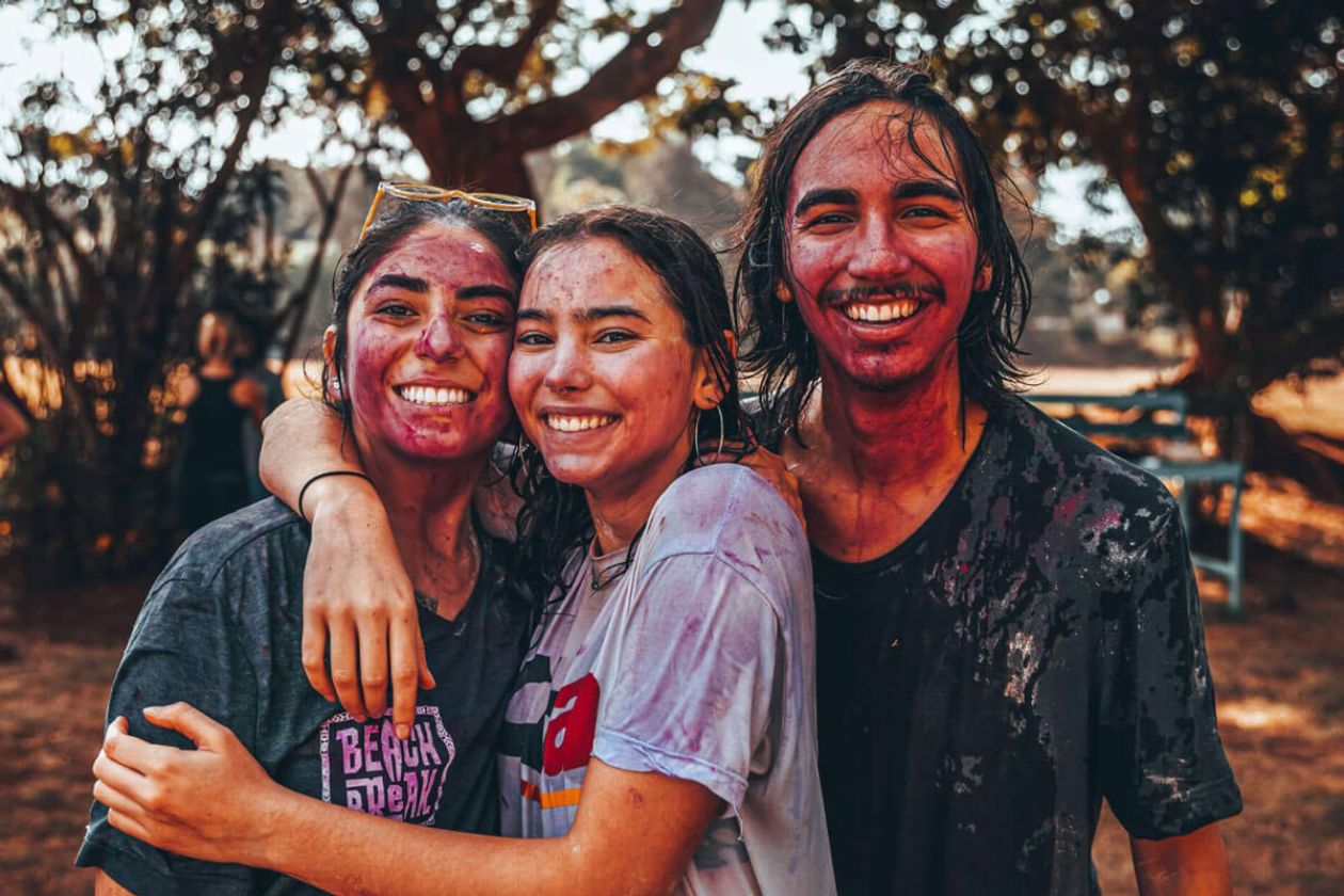
No required subjects
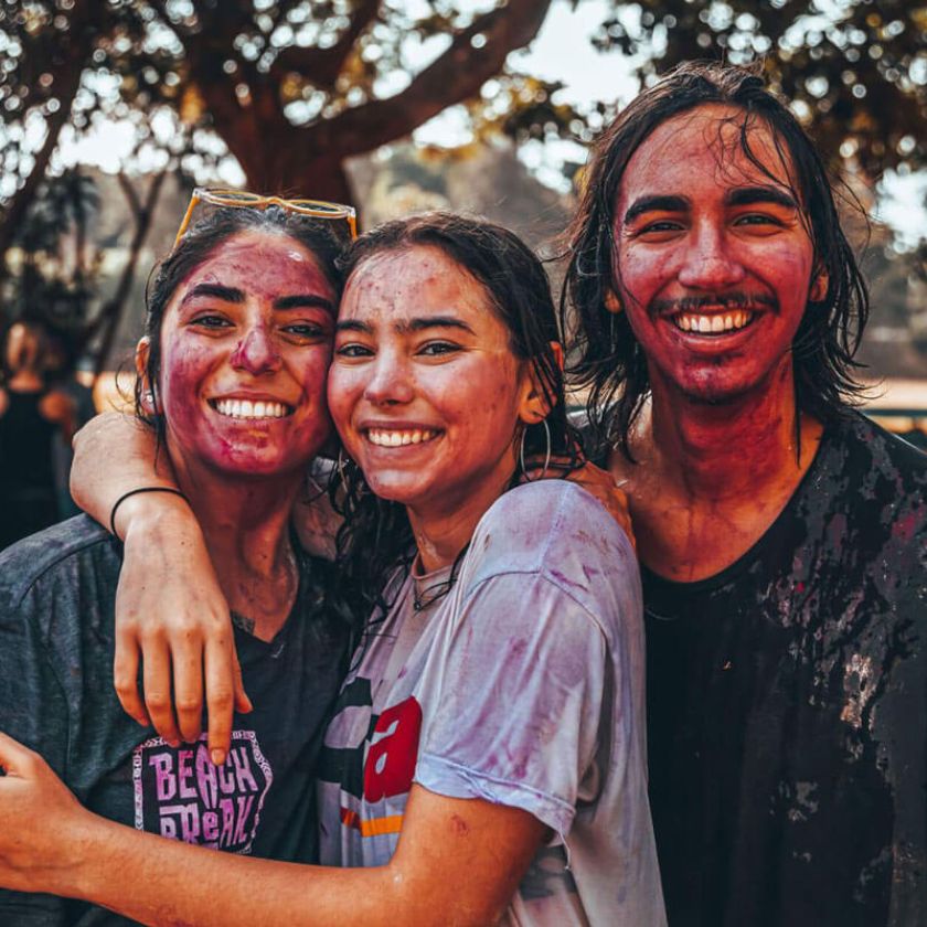
Rochester’s signature open curriculum gives you the freedom to design your own path—no core requirements holding you back. You can dive deep into the disciplines you love, test out new fields, and truly tailor your coursework to your passions.
That flexibility encourages intellectual risk-taking and cross-disciplinary connections you won’t find at most universities. It’s no surprise that 90% of incoming students say our open curriculum was a major factor in their decision to enroll.
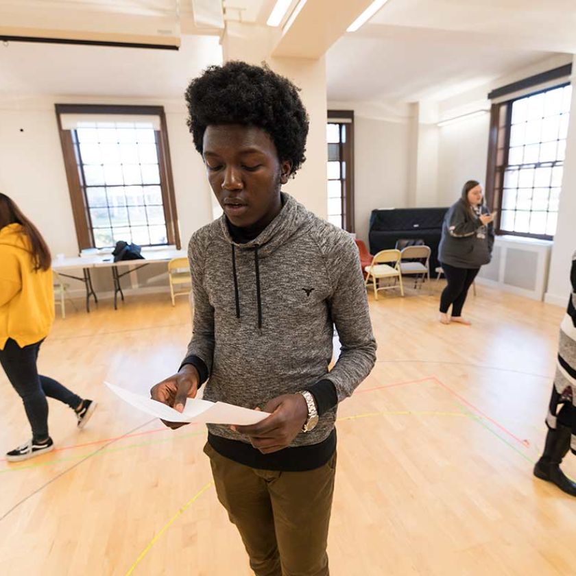
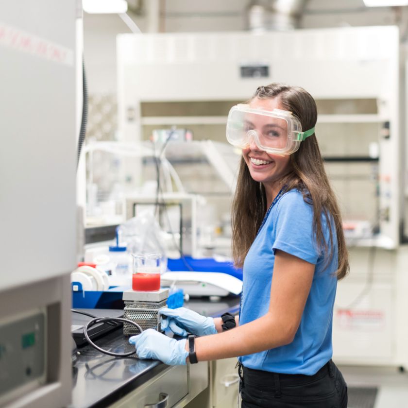
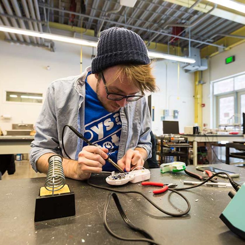
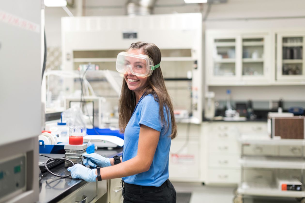
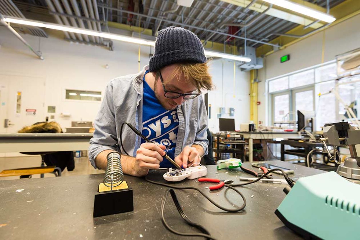
Student research
As an R1 university, Rochester puts you squarely in the middle of groundbreaking work from day one. You’ll pair up with faculty mentors on real projects—whether you’re in a lab, the field, or a studio—bridging theory and practice in meaningful ways.
Our smaller size means you won’t be just another face in the crowd; you’ll get hands-on guidance and real responsibility. That immersive experience sparks curiosity and builds the skills employers and grad schools crave.
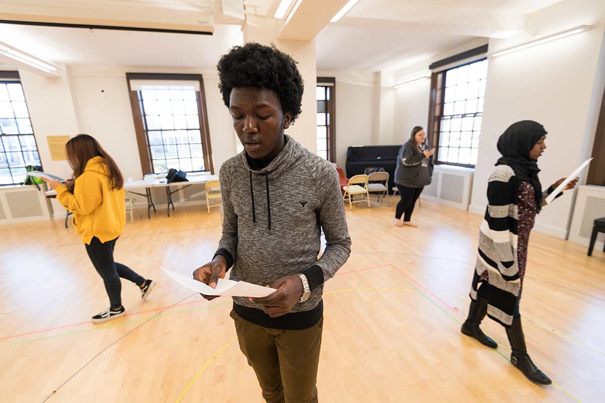
Take Five
The Take Five program is one of the only tuition-free fifth-year offerings in higher ed, letting you press pause on your major and pursue something entirely new. Use that extra year to launch a startup, learn a language, produce a creative work, or explore an emerging field outside your degree.
You get the same support and access you’ve had all four years—just with room to roam. It’s a chance to deepen your roots at Rochester while branching out in ways you never imagined.
Study abroad
Broaden your perspective with one of hundreds of study-abroad programs in more than 50 countries—from art studios in Florence to sustainability labs in Costa Rica. Our experienced advisors help you find the perfect fit, navigate funding, and ensure your safety and well-being overseas.
Living and learning in a new culture will sharpen your language skills, deepen your empathy, and give you insights you can’t get in a classroom alone. With 25% of Rochester students participating, study abroad is a cornerstone of our global-minded community.
Your education, your way
No required subjects
Rochester’s signature open curriculum gives you the freedom to design your own path—no core requirements holding you back. You can dive deep into the disciplines you love, test out new fields, and truly tailor your coursework to your passions.
That flexibility encourages intellectual risk-taking and cross-disciplinary connections you won’t find at most universities. It’s no surprise that 90% of incoming students say our open curriculum was a major factor in their decision to enroll.
Student research
As an R1 university, Rochester puts you squarely in the middle of groundbreaking work from day one. You’ll pair up with faculty mentors on real projects—whether you’re in a lab, the field, or a studio—bridging theory and practice in meaningful ways.
Our smaller size means you won’t be just another face in the crowd; you’ll get hands-on guidance and real responsibility. That immersive experience sparks curiosity and builds the skills employers and grad schools crave.
Take Five
The Take Five program is one of the only tuition-free fifth-year offerings in higher ed, letting you press pause on your major and pursue something entirely new. Use that extra year to launch a startup, learn a language, produce a creative work, or explore an emerging field outside your degree.
You get the same support and access you’ve had all four years—just with room to roam. It’s a chance to deepen your roots at Rochester while branching out in ways you never imagined.
Study abroad
Broaden your perspective with one of hundreds of study-abroad programs in more than 50 countries—from art studios in Florence to sustainability labs in Costa Rica. Our experienced advisors help you find the perfect fit, navigate funding, and ensure your safety and well-being overseas.
Living and learning in a new culture will sharpen your language skills, deepen your empathy, and give you insights you can’t get in a classroom alone. With 25% of Rochester students participating, study abroad is a cornerstone of our global-minded community.